> For the complete documentation index, see [llms.txt](https://docs.ilert.com/llms.txt). Markdown versions of documentation pages are available by appending `.md` to page URLs; this page is available as [Markdown](https://docs.ilert.com/incidents-and-status-pages/service-topology.md).
# Service topology
Visualize how your services depend on one another and understand the impact of an outage with the Service Health map, reconstructed automatically from your OpenTelemetry traces.
Service topology gives you a live, connected view of your [services](/incidents-and-status-pages/services.md) and the dependencies between them. Instead of maintaining a static architecture diagram, ilert reconstructs the dependency graph automatically from the OpenTelemetry traces your services emit, so the map always reflects how your system actually behaves in production.
The topology powers two things:
* the **Service Health map** — an interactive graph you can explore during an incident to find the blast radius and the likely root cause
* richer context for AI SRE alert triage, which walks the dependency graph to reason about where a problem originates
## How the topology is built
There are two ways a dependency edge ends up in the graph:
1. **Discovered from traces** — when you connect a [telemetry source](/incidents-and-status-pages/service-topology/telemetry-sources.md), your services push OpenTelemetry traces to ilert. ilert inspects outbound (client and producer) spans to derive service-to-service edges and continuously updates the graph. A service is created automatically in your [service catalog](/incidents-and-status-pages/services.md) the first time it appears in a discovered edge — either as the caller (source) or as the target. A service that only emits server-side spans and never participates in a discovered edge is not created on its own.
2. **Added manually** — you can draw a dependency between two services yourself, for example to capture a relationship that isn't (yet) visible in traces.
Every edge and every auto-created service keeps its **provenance**, so you can always tell whether a dependency was discovered from telemetry, auto-discovered, or created by a human.
## The Service Health map
**Service Health** sits in the primary navigation, above the sidebar sections. It offers two views of the same topology:
* **Map** — the interactive dependency graph
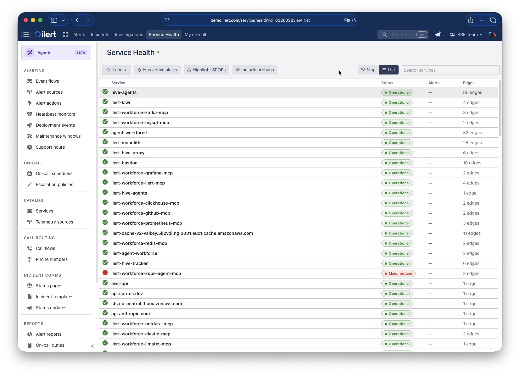
* **List** — the same services in a sortable table, with **Status**, **Alerts** and **Edges** columns
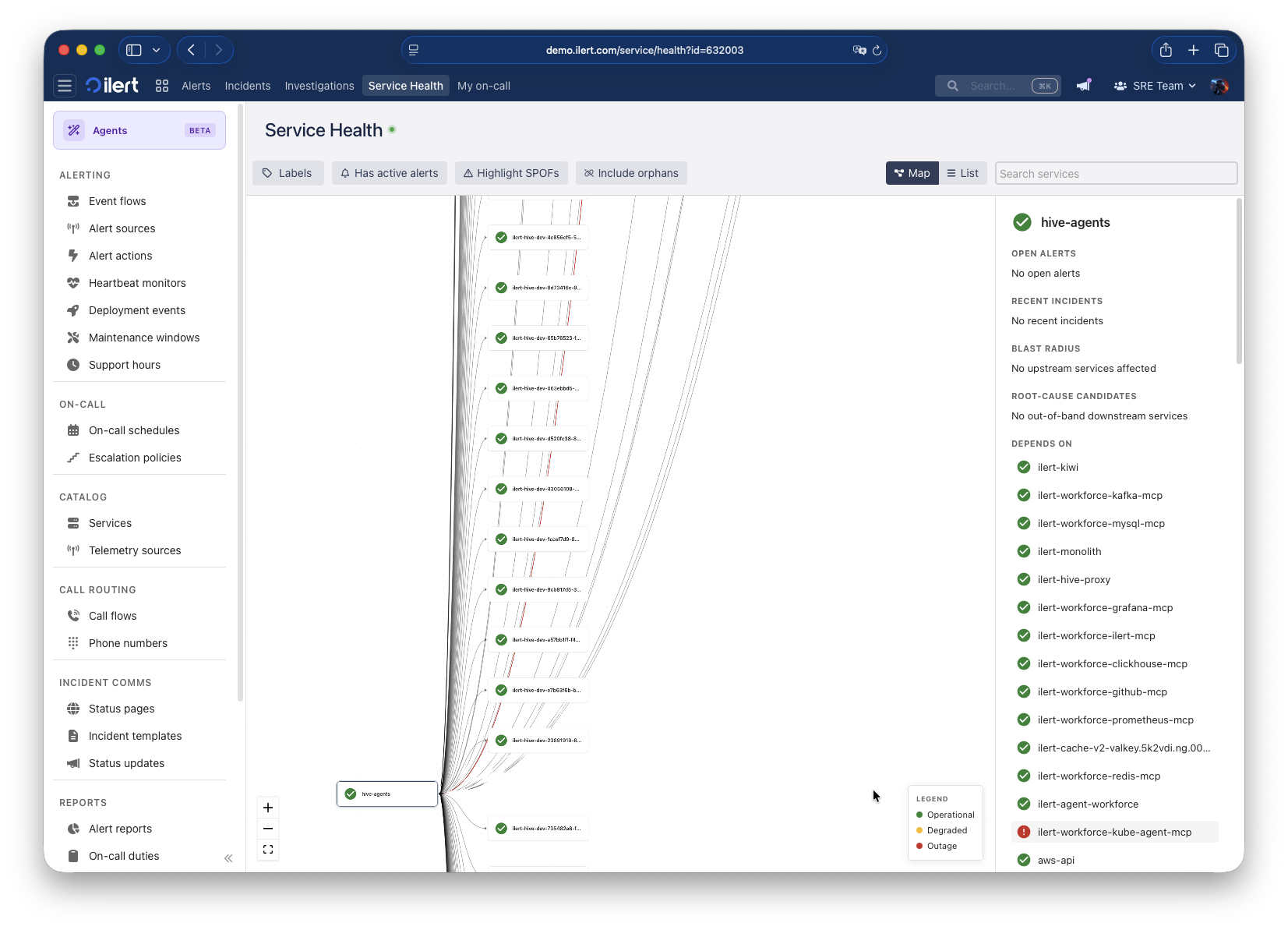
The Service Health map, with a service selected and its side panel open
Switch to **List** for a scannable overview of the same services:
The Service Health list view
### Node status and legend
Each node is colored by the current status of the service. The map legend uses three colors:
| Color | Meaning |
| ----- | ----------- |
| Green | Operational |
| Amber | Degraded |
| Red | Outage |
The **List** view shows the precise [service state](/incidents-and-status-pages/services.md) instead — for example `Operational` or `Major outage`. Nodes you don't have permission to see are shown as **Restricted**.
### Spotlight, blast radius and root cause
When you select a node, the map pans and zooms to it, dims the unrelated nodes, and lights up the paths that matter:
* **Blast radius** — the services **upstream** of the selected service that are affected when it degrades (who depends on this).
* **Root-cause candidates** — the services **downstream** of the selected service that could be causing its problem (what this depends on). The panel hints where to *look next*.
A side panel opens alongside the selection with:
* **Open alerts** on the service, with a high/low breakdown and a link into Alerts
* **Recent incidents** affecting the service
* **Blast radius** and **Root-cause candidates**
* **Depends on** — the service's direct downstream dependencies
### Filtering the map
Use the controls above the map to focus on what matters:
* **Labels** — filter to the services carrying specific labels.
* **Has active alerts** — prune the view to only the services that are currently alerting.
* **Highlight SPOFs** — emphasize single points of failure in the graph.
* **Include orphans** — show services that have no dependencies. When off, only services connected to at least one other service are shown.
* **Search** — jump to a service by name.
{% hint style="info" %}
The map updates **live** as new traces arrive — the header shows when the topology was last updated. Very large graphs may exceed the display limit; filter by labels to render a sub-graph.
{% endhint %}
## Service dependencies
Every service has a **Dependencies** tab that lists its edges in both directions:
* **Depends on** — the services this service calls (downstream)
* **Depended on by** — the services that call this service (upstream)
Dependencies discovered from traces show when they were **last seen**, so stale edges are easy to spot. You can also add a dependency manually.
### Add a dependency manually
1. Open the service and go to the **Dependencies** tab.
2. Click **Add dependency**.
3. Choose the **target service** and, optionally, add a note describing why the dependency exists.
4. Save.
To remove an edge, use **Remove dependency** on the dependency you want to delete.
{% hint style="info" %}
Manually drawn dependencies are never overwritten by trace discovery, and edits to an existing service (its labels, links, or dependencies) are preserved — trace ingestion only *adds* what it discovers.
{% endhint %}
{% hint style="warning" %}
Removing a **discovered** dependency is only permanent if the underlying calls have stopped. If the two services are still communicating, the edge is observed again in your traces and re-created on the next sync. To remove such an edge for good, stop the traffic (or the instrumentation) that produces it.
{% endhint %}
## Provenance and auto-created services
When ilert first sees a service as part of a discovered dependency in your traces, it creates it in the service catalog and records how it was created. The **Provenance** of a service or dependency can be any of:
| Provenance | Meaning |
| ------------------------ | ------------------------------------------------------ |
| OpenTelemetry | Reported by traces from a telemetry source |
| Auto-discovered | Inferred as the target of a discovered dependency edge |
| Manual | Created or drawn by a user |
| Terraform / Pulumi / API | Created through infrastructure-as-code or the API |
Auto-created services are also enriched with **labels** derived from OpenTelemetry resource attributes (environment, namespace, version, language, Kubernetes and cloud metadata, and more). Labels are applied only when a service is first created — your manual edits are always safe. See [telemetry sources](/incidents-and-status-pages/service-topology/telemetry-sources.md#labels-on-discovered-services) for the full mapping.
## Next steps
* [Connect a telemetry source](/incidents-and-status-pages/service-topology/telemetry-sources.md) to start reconstructing your topology from traces.
* Review the services ilert created for you in the [service catalogue](/incidents-and-status-pages/services.md).
---
# Agent Instructions
This documentation is published with GitBook. GitBook is the documentation platform designed so that both humans and AI agents can read, navigate, and reason over technical content effectively. Learn more at gitbook.com.
## Querying This Documentation
If you need additional information that is not directly available in this page, you can query the documentation by asking a question.
Perform an HTTP GET request on the following URL with the `ask` and `goal` query parameters:
```
GET https://docs.ilert.com/incidents-and-status-pages/service-topology.md?ask=&goal=
```
`ask` is the immediate question: it should be specific, self-contained, and written in natural language.
`goal` is what the user is ultimately trying to achieve, the reason they need the answer. Sharing it helps GitBook give you a better, more relevant answer. A goal is most helpful when it describes the outcome the user wants rather than restating the question. For example, with `ask=how do I create an API token`, a goal like `automate deployments from our CI pipeline` lets GitBook tailor the answer to that use case.
The response will contain a direct answer to the question and relevant excerpts and sources from the documentation.
Use this mechanism when the answer is not explicitly present in the current page, you need clarification or additional context, or you want to retrieve related documentation sections.